Pages: 1-2-3-4-5-6
Step 22: Adding a Shadow Behind the Lights (optional)
Next, we’ll darken the area around the top of the lights against the corkboard to give them a little more emphasis. This step is optional.
In the Layers palette, select the "lip” layer and click the "Create a new layer” icon at the bottom of the Layers palette. The new layer will appear above the "lip” layer. Rename it to "top_shadow.”
Using the Gradient tool (G), with the preset Foreground to Transparent, type Linear Gradient and a foreground color of black, Shift-drag in the "top_shadow” layer as shown:

The "top_shadow” layer needs to be masked so that it excludes the lights.
Select the layer groups "light_center,” "light_right” and "light_left.” Duplicate and merge them into a single layer.
Command-click the layer thumbnail in the Layers palette to load the layer’s transparency as a selection.

Go to Select > Inverse to invert the selection. Now select the "top_shadow” layer in the Layers palette and click the "Add layer mask” icon at the bottom of the palette.
Change the "top_shadow” layer’s opacity to 60%, and its blending mode to Overlay.
Finally, delete the "light_left copy” layer.

Step 23: Adding Text, The Final Step
As the final step, inlaid text will be added to the corkboard. Any font(s) can be used, but this example uses Arista 2.0 Light and DIN Mittelschrift. (How to use Photoshop’s Text Tool will not be covered in this part of the tutorial.)
The text layers should be placed above all other layers in the Layers palette.

In the Layers palette, double-click in the area to the right of the text layer’s name. This will open up the Layer Style dialog box.

In the Layer Style window, adjust the settings as shown.
Drop Shadow:

Inner Shadow:

Color Overlay:

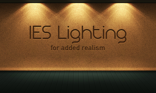
Final Result
This is the final result:
Further Suggestions
I recommend that this effect be used sparingly. For example, use it only to highlight a logo in the header of a website, or to emphasize a few elements on a page.
Angling the light(s) can further enhance the effect; flipping the effect vertically gives the impression of footlights.
You can also colorize the lighting by use of a Color Overlay or Gradient Overlay layer style.
For this tutorial, I selected an IES profile that has been very popular in 3D art, as it has such a distinct appearance. For this reason it has become overused and clichéd. However, there are hundreds of other IES/photometric profiles freely available:
Karbaras’s IES Generator also allows you to create your own profiles.
I hope you enjoyed this tutorial!
Subscribe to the Psdtuts+ RSS Feed for the best Photoshop tuts and articles on the web.